Sweet Jesus, look at that art. Is Kipling West a six-year-old?
VoidedNote
★★★☆☆ (3.2/5.0)(15 votes)
:O CHUCK NORRIS IS A DWARF?!
Lyoncet
★★☆☆☆ (2.5/5.0)(4 votes)
Congratulations Dwarven Thaumaturgist; The Fate of the Flammable is no longer the only Magic card whose art has made me laugh out loud.
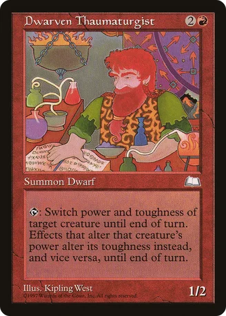
As for the card itself, yeah, he's vulnerable, but the effect is versatile enough that you should hardly ever see a game where it won't help you out somehow. "OK, you pay your 3 mana and Ball Lightning me for 1. Actually, you ball lightning me, I block with my Thaumaturgist and then activate it. Just cuz." And god knows this is way better than most Dwarves out there, especially pre-Odyssey.
Kryptnyt
★★☆☆☆ (2.5/5.0)(11 votes)
I'm sure Kipling is a better artist than you, Scissorslizard. The art isnt bad. New players like the computer generated art though.
jsttu
★★★★★ (5.0/5.0)(6 votes)
This guy did such great work he inspired a generation of Merfolk Thaumaturgists to take up his trade.
scumbling1
★★★☆☆ (3.7/5.0)(14 votes)
"I'm sure Kipling is a better artist than you, Scissorslizard.
The art isnt bad. New players like the computer generated art though."
Ad hominem arguments don't make this card look less ugly.
Also, do you have some sort of basis for the sweeping generalization of newer players?
Teotanek
★★★★☆ (4.4/5.0)(8 votes)
I like the art it's simple and rather symbolic
Atali
★★★★☆ (4.1/5.0)(11 votes)
I like the art. Photorealism has taken over the Magic art scene, and I miss the days when more stylized art appeared on cards.
Helliord
★★★★☆ (4.5/5.0)(10 votes)
It is a pity that so many gamers nowadays prefer the generic, grade-B Dungeons & Dragons-style trolls and zombies on newer Magic cards over the paintings of old which actually looked like real artwork... The Golden Age of Magic art in sets like Legends and Ice Age was timeless and inspiring. They were beautiful and left something to the imagination. Many of them would be fit to hang on a wall in a larger size...
Because when I think of beautiful and timeless Magic art, I don't think of Rebecca Guay's Starlit Angel or Pete Venters' spectacular Hellfire. And why mention Quinton Hoover's spectacularly detailed Archangel or even the passion and simplicity of Ball Lightning?
No, when I think of awesome old Magic art, I think of freaking Dwarven Thaumaturgist. Hell yeah, undetailed, unshaded, non-abstract, flat as a pancake art is the best. 'Cause it's different, you know?
Salient
★★★★★ (5.0/5.0)(1 vote)
This card isn't as funny as Mudhole, but I love the beard. I think this guy's name is Tarv.
Eliteninjasauce
★★★★★ (5.0/5.0)(1 vote)
Ah HA take that Doran, the Siege Tower and all your treefolk minions! Who has the last laugh now eh?
Anathame
★★★★☆ (4.7/5.0)(6 votes)
I actually really like the art.
Shadoflaam
★★★☆☆ (3.0/5.0)(8 votes)
Okay, whatever. Go ahead and say Baneslayer looks like crap, that a 3 year old could chuck out Orzhov Guildmage, and that Stasis has better art than anything else because of its "significance." That does not change that this looks like it was in an episode of Scooby-Doo, while Ulamog, the Infinite Gyre would be worthy of a museum.
luca_barelli
★★★☆☆ (3.1/5.0)(7 votes)
Much of the old art wasn't that great. Magic art isn't supposed to look like a painting, it's supposed to immerse you in a fantasy world. The art we have now is much richer, more complex, and more realistic; an upgrade over what came before. Not that all old artworks are bad, many are awesome and quite iconic, but don't defend this simplistic, flat piece of crap.
HedronMyr
★★★☆☆ (3.2/5.0)(5 votes)
Dr Jack must be trolling...or colorblind...or maybe likes fauvism, or all of the above. I can wholeheartedly accept that some people prefer the stylistic approach to MTG, but I for one can't really see the validity of the argument, barring some reprints like Planechase's version of Balefire Liege, but that has much less to do with the artist and much more to do with the printing. The picture here fails to capture any transparency of the bottles, which, even without computers, is very possible to do. The figure himself barely captures the essence of a dwarf, and lacks the proper width of one. Differing preferences or not, "golden age" are really strong words, and there's no way a half catoorny, half "realistic" image can live up to that.
Mode
☆☆☆☆☆ (0.0/5.0)
2005/11/1 "Note that the wording "Effects that alter the creature's power alter its toughness instead, and vice versa, this turn" has been removed."
Why, actually? I know it makes this a messy ability that you have to keep track of until end of turn, but that's how the card was originally designed. And since Wizards wants their cards' functionality as close to the original intent as possible, shouldn't they add that line again?
steinburger1109
☆☆☆☆☆ (0.0/5.0)
Mode, they removed the line because it is now standard rules for Magic. I believe this was the first card to feature such an ability, and that made it necessary to explain it. Now, there is a rule for it, so specifics on the card is not so much a necessity.
Tiggurix
★★☆☆☆ (2.8/5.0)(2 votes)
@Shadoflaam: If there's one thing I'm sure about, it's that Ulamog would not end up in a museum. Ulamog's illustration is many things. Skillful; yes. Pretty; maybe. But it's not art. Stasis, on the other hand, could potentially have ended up in a museum. I'm sorry, but you're wrong in this case. Dead wrong.
DritzD27
☆☆☆☆☆ (0.0/5.0)
I actually like this art, it makes me think of it being in a series of tapestries all depicting some function of a city or some such thing.
Dragasm
☆☆☆☆☆ (0.0/5.0)
He has a hoof for a beard...
SarcasmElemental
★★☆☆☆ (2.8/5.0)(2 votes)
Photorealism alone describes the general difference between the new and old card art. Magic is a game of fantasy and realism has no business within.
Nagoragama
☆☆☆☆☆ (0.0/5.0)
Such doofy art. But I do like it.
Mirrordin_Pure
☆☆☆☆☆ (0.0/5.0)
It's so red; it looks like material popping off the card like those strange little books for infants. 5/5 for blindingly red hair
EDIT: Strangely can both kill and interact with a Doran EDH in interesting ways.
Kodanshi
☆☆☆☆☆ (0.0/5.0)
Art aside, why is this card Restricted, but its blue counterpart, Merfolk Thaumaturgist, isn’t? Or is the art so cool/bad/eye–poppingly stylised that a deck can only handle one at a time?
Comments (24)
As for the card itself, yeah, he's vulnerable, but the effect is versatile enough that you should hardly ever see a game where it won't help you out somehow. "OK, you pay your 3 mana and Ball Lightning me for 1. Actually, you ball lightning me, I block with my Thaumaturgist and then activate it. Just cuz." And god knows this is way better than most Dwarves out there, especially pre-Odyssey.
The art isnt bad. New players like the computer generated art though.
The art isnt bad. New players like the computer generated art though."
Ad hominem arguments don't make this card look less ugly.
Also, do you have some sort of basis for the sweeping generalization of newer players?
Because when I think of beautiful and timeless Magic art, I don't think of Rebecca Guay's Starlit Angel or Pete Venters' spectacular Hellfire. And why mention Quinton Hoover's spectacularly detailed Archangel or even the passion and simplicity of Ball Lightning?
No, when I think of awesome old Magic art, I think of freaking Dwarven Thaumaturgist. Hell yeah, undetailed, unshaded, non-abstract, flat as a pancake art is the best. 'Cause it's different, you know?
"Note that the wording "Effects that alter the creature's power alter its toughness instead, and vice versa, this turn" has been removed."
Why, actually? I know it makes this a messy ability that you have to keep track of until end of turn, but that's how the card was originally designed. And since Wizards wants their cards' functionality as close to the original intent as possible, shouldn't they add that line again?
5/5 for blindingly red hair
EDIT: Strangely can both kill and interact with a Doran EDH in interesting ways.