This is the most breathtaking piece I have seen in a long, long time.
Redgurr
★★★★★ (5.0/5.0)(5 votes)
Artist really out-did themselves on this piece, can't wait to collect a playset.
Moxxy
★★★★☆ (4.6/5.0)(4 votes)
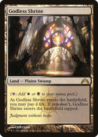
I love the stained glass with purple and red hues used in Orzhov cards in this set.
SyntheticDreamer
★★★☆☆ (3.8/5.0)(2 votes)
Absolutely incredible art on this one. The original art is still a little better, IMO, but this one is great in its own right, and likely looks much better in foil.
Also, that flavor text...
hot4boys
☆☆☆☆☆ (0.5/5.0)(5 votes)
the le reddit r/mtg army and its leejun loves this card!
LordOfTheFlies87
★★★★★ (5.0/5.0)(3 votes)
As we shall all ever say: art.
BongRipper420
★★★★★ (5.0/5.0)(2 votes)
Even if I didn't have a deck, I'd get a playset of this simply for it's pretty appearance.
At the time of this comment, this land has a rating of 4.935. Likely due to this being one of he most beautiful lands ever printed. Cliff Childs has proven himself to be an incredible artist, and this is his masterpiece. An easy 5/5.
Purplerooster
★★☆☆☆ (2.5/5.0)(7 votes)
Does anybody else feel like the Orzhov are kinda of like Catholics?
Gcrudaplaneswalker
★★★★☆ (4.8/5.0)(3 votes)
Rob Alexander is a legend, but the art on this card makes me stop a moment to appreciate it. Also they nailed the flavor text.
deserter
★★★★★ (5.0/5.0)(2 votes)
Judgement without hope. Medieval inquisition.
EmptyMirage
★★★★★ (5.0/5.0)(1 vote)
It would be awesome if the foiled version just foiled the stain glass.
DarthParallax
☆☆☆☆☆ (0.8/5.0)(4 votes)
Purplerooster I actually think I know what you mean :D
All of Ravnica feels very Medieval/Renaissance-y to me, with some of it looking very Russian, some of it looking very Italian, and some of it looking almost French? the Simic and Dimir come across as completely Futuristic by comparison to the Gothic Cityscape.
Orzhov-Flavor is pretty much why Kaalia is my Absolute Favorite Card except Jace, the Mind Sculptor and some other things because nobody really has a single favorite card. :)
The Orzhov and the Rakdos both feel very, VERY Catholic. Obzedat is what can always happen to any Religion: frankly, Religions wield Power in Society, and from the prologue to the Fellowship of the Ring: "9 Rings were gifted to the Race of Men, who above all else, desire Power" Power Corrupts and Absolute Power Corrupts Absolutely. The Rakdos are somewhat blatantly the first 6 or 7 odd Circles of Dante's Inferno, down until Hell Freezes Over.
Magic and DnD are both games, and games need plots, challenges or obstacles or villains to defeat of some kind, so it makes a fair amount of sense for them to present organized Religions, when they do so at all, as being full of corruption-- to give the Good Heroes something to fight against.
I do not think that the Orzhov represent FAITHFUL Catholics though. That'd be something like Boros + Selesnya + Azorius all somehow being able to be harmonius together? Oh, and obviously it doesn't get any more Catholic than Mikaeus, the Pope of Innistrad :)
It could be just because my High School English Teacher was a little scarily enthusiastic and a LOT scarily skilled at Dante's Inferno, but I've been getting a major Catholic Vibe recently from White and Black cards, other than just the obvious Angel and Demon creature types :)
However. I argue with the flavor text. House Dimir is out in the open. Therefore I assume there isn't any other kind of "Secret" on Ravnica except "Open." I can accept the Obzedat specifically are evil and corrupt even if Vizkopa likely originally was not. However, if they never offered anyone Hope, AND EVERYONE KNEW THAT (Secrets are Open on Ravnica) nobody would trade them their souls or coins, ever. Eh, well, maybe Dragon's Maze will present Orzhov being a little bit Whiter than so far. Evil gets people by offering them *the exact. same. thing.* GOOD does, only with a different pricetag. Like the difference between Psychiatrists and Friends. :)
BadProgram
★★★★★ (5.0/5.0)(3 votes)
I buy sets like this for it's flavor. I actually tried going pro, but since I got my own house, I now build crap-loads of flavor-filled (yet balanced) casual house decks for friends with 61+ card decks who get tired of losing, so awesomly flavored cards are welcome in this house.
The_Evictee
☆☆☆☆☆ (0.0/5.0)
@ DarthParallax
you have to tell that to my former landlords!!!!!!!!!!!!!! XD
Enemy_Tricolor
★★★★★ (5.0/5.0)(2 votes)
I love shocklands. I love . And I love this art. This card is inspiring inappropriate feelings in me.
Pipikako
☆☆☆☆☆ (0.0/5.0)
The best art in magic the gathering !! Absolutely amazing.....
VirusVescichetta
☆☆☆☆☆ (0.0/5.0)
The foil version of this card is exactly as beautiful as one would imagine. Stunning art, as has already been said.
Salient
★★★★★ (5.0/5.0)(1 vote)
I think it's funny (and appropriate) how everyone in my play group now knows who Cliff Childs is, as 'the guy that did the art for Godless Shrine.'
That's enough to get your combo brains started. There are obviously hundreds of other ways the types are relevant; such as the obvious fetchlands and things..
Jitteryowl
☆☆☆☆☆ (0.0/5.0)
Wait... It's a cathedral, but also a plains and a swamp?
MasterOfWaves
☆☆☆☆☆ (0.0/5.0)
As this was reprinted just before Theros, I am guessing that either BW will never get a god, for some flavor reason, or that Athreos will be printed in Journey to Nyx.
Comments (23)
Also, that flavor text...
At the time of this comment, this land has a rating of 4.935. Likely due to this being one of he most beautiful lands ever printed. Cliff Childs has proven himself to be an incredible artist, and this is his masterpiece. An easy 5/5.
All of Ravnica feels very Medieval/Renaissance-y to me, with some of it looking very Russian, some of it looking very Italian, and some of it looking almost French? the Simic and Dimir come across as completely Futuristic by comparison to the Gothic Cityscape.
Orzhov-Flavor is pretty much why Kaalia is my Absolute Favorite Card except Jace, the Mind Sculptor and some other things because nobody really has a single favorite card. :)
The Orzhov and the Rakdos both feel very, VERY Catholic. Obzedat is what can always happen to any Religion: frankly, Religions wield Power in Society, and from the prologue to the Fellowship of the Ring: "9 Rings were gifted to the Race of Men, who above all else, desire Power"
Power Corrupts and Absolute Power Corrupts Absolutely.
The Rakdos are somewhat blatantly the first 6 or 7 odd Circles of Dante's Inferno, down until Hell Freezes Over.
Magic and DnD are both games, and games need plots, challenges or obstacles or villains to defeat of some kind, so it makes a fair amount of sense for them to present organized Religions, when they do so at all, as being full of corruption-- to give the Good Heroes something to fight against.
I do not think that the Orzhov represent FAITHFUL Catholics though. That'd be something like Boros + Selesnya + Azorius all somehow being able to be harmonius together? Oh, and obviously it doesn't get any more Catholic than Mikaeus, the Pope of Innistrad :)
It could be just because my High School English Teacher was a little scarily enthusiastic and a LOT scarily skilled at Dante's Inferno, but I've been getting a major Catholic Vibe recently from White and Black cards, other than just the obvious Angel and Demon creature types :)
However. I argue with the flavor text. House Dimir is out in the open. Therefore I assume there isn't any other kind of "Secret" on Ravnica except "Open." I can accept the Obzedat specifically are evil and corrupt even if Vizkopa likely originally was not. However, if they never offered anyone Hope, AND EVERYONE KNEW THAT (Secrets are Open on Ravnica) nobody would trade them their souls or coins, ever. Eh, well, maybe Dragon's Maze will present Orzhov being a little bit Whiter than so far. Evil gets people by offering them *the exact. same. thing.* GOOD does, only with a different pricetag. Like the difference between Psychiatrists and Friends. :)
you have to tell that to my former landlords!!!!!!!!!!!!!! XD
His Island for M2012 is pretty kickass too.
Hallowed Fountain
Watery Grave
Blood Crypt
Stomping Ground
Temple Garden
Godless Shrine <-- You are here.
Overgrown Tomb
Breeding Pool
Steam Vents
Sacred Foundry
-Flagstones
-Krosan Verge
Can be grabbed as a swamp:
-Liliana of the dark realms
-Korlash
That's enough to get your combo brains started. There are obviously hundreds of other ways the types are relevant; such as the obvious fetchlands and things..