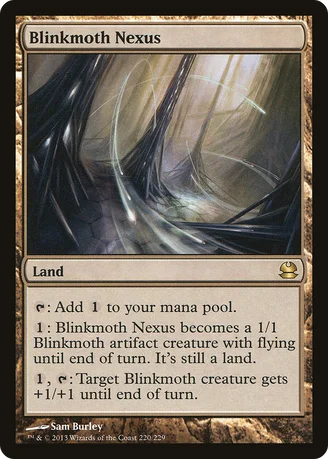
I agree, the art is absolutely astounding. The card itself is a bit cleaner too. No complaints with this one, although most would probably have anticipated Mutavault.
Mode
★★★★☆ (4.2/5.0)(2 votes)
(Artwork rant)
"It seems to be very strongly inspired by Inkmoth Nexus." @DarthParallax Are you referring to the artwork? Because if you mean the card, it would be the other way round :D Then again, you probvably do, since you most probably know Modern Masters is a reprint set. And the two artworks do indeed look similar, they both give a calm, yet swift impression. The Inkmoth one looks far more eerie, while this one looks more neutral, though. Which does make perfect sense, i'd say. The new artwork in comparison to the original one looks much more mysterious.
DarthParallax
★★☆☆☆ (2.0/5.0)(3 votes)
It seems to be very strongly inspired by Inkmoth Nexus. but this isn't a bad thing. Sometimes Expectations are okay to Fill, and sometimes that means getting Predictable. :)
Predictability is good because it makes the Unpredictable....Unpredictable. And yet, so guaranteed, it's Predictable. o.O
It's quiet here. too quiet. >.>
Mode: Yes, I knew that Inkmoth Nexus was Design-Inspired by this. Modern Masters is Chronicles 2.0. I have this really Super Secret Tech. I can read. And I have the internet. :P This is one of those 20-30 new arts they put in their announcement. I'm not sure people can read those. They keep saying things like "Lightning Bolt should have been in this." I guess Counterspell and Dark Ritual should have, too, they were only off by one Core Set as well. -_- Not ranting at you now, but sometimes the ability to read actually feels like Super Secret Tech. :P
SAUS3
★★★★★ (5.0/5.0)(1 vote)
I really like this new art. It looks really cool. The old one was kind of weird.
As for the card, I think it is pretty damn strong, but not stupidly broken. You can't just include it in every deck like some people say because it is still a colourless land.
SyntheticDreamer
★★★★★ (5.0/5.0)(1 vote)
Sweet art. This looks more like Inkmoth Nexus (or rather, Inkmoth Nexus looks more like this) than the original did.
TomWarleader
☆☆☆☆☆ (0.0/5.0)
I bet this card looks pretty neat in foil.
Doaj
☆☆☆☆☆ (0.0/5.0)
I managed to obtain a foil one of these. Absolutely gorgeous card. Easily one of the best foils I've ever seen, and on a card of such caliber. 5/5.
NinStarRune
☆☆☆☆☆ (0.0/5.0)
Stunning as foil.
OlvynChuru
☆☆☆☆☆ (0.0/5.0)
Combos with Blinkmoth's Will. Not to mention Blinkmoth's Bargain.
Comments (10)
"It seems to be very strongly inspired by Inkmoth Nexus."
@DarthParallax Are you referring to the artwork? Because if you mean the card, it would be the other way round :D
Then again, you probvably do, since you most probably know Modern Masters is a reprint set.
And the two artworks do indeed look similar, they both give a calm, yet swift impression. The Inkmoth one looks far more eerie, while this one looks more neutral, though. Which does make perfect sense, i'd say. The new artwork in comparison to the original one looks much more mysterious.
Predictability is good because it makes the Unpredictable....Unpredictable. And yet, so guaranteed, it's Predictable. o.O
It's quiet here. too quiet. >.>
Mode: Yes, I knew that Inkmoth Nexus was Design-Inspired by this. Modern Masters is Chronicles 2.0. I have this really Super Secret Tech. I can read. And I have the internet. :P This is one of those 20-30 new arts they put in their announcement. I'm not sure people can read those. They keep saying things like "Lightning Bolt should have been in this." I guess Counterspell and Dark Ritual should have, too, they were only off by one Core Set as well. -_- Not ranting at you now, but sometimes the ability to read actually feels like Super Secret Tech. :P
As for the card, I think it is pretty damn strong, but not stupidly broken. You can't just include it in every deck like some people say because it is still a colourless land.