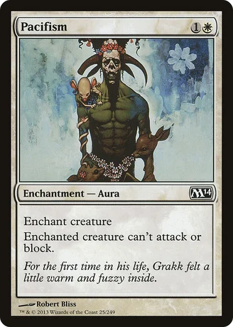
In protest for having the same damn art and flavor text since 8th edition, I will personally eat every copy of this I come across.
SyntheticDreamer
★★★★☆ (5.0/5.0)(11 votes)
For the ELEVENTH time in his life...seriously, Grakk needs to find a new day job.
lilwolf2005
★★★★☆ (4.0/5.0)(5 votes)
I was hoping they would use the Akroma art, or something else. Wizards, I AM DISAPPOINT.
Tiggurix
★★★★☆ (4.8/5.0)(3 votes)
Now, personally, I rather like this illustration and its accompanying flavour text, but I have to agree that it would be refreshing with a change of pace.
Yozuk
★★★☆☆ (3.2/5.0)(4 votes)
I used to have an Onslaught pacifism. I don't know what happened to it. But it was a really nice art and was loaded with flavor. it made me want to use the card. This.. This art is so dull. And the flavor doesn't make a whole lot of sense to me. You can feel warm and fuzzy while still being a blood thirsty murderer. I can't imagine why they would keep using it.
Mode
★★★☆☆ (3.5/5.0)(3 votes)
It's weird that they chose that art yet again. It's instantly recognizable, i'll give it that. And by now somewhat nostalgic for some people as well, me included.
In general, i prefer it when a consistent reprint keeps the old artwork (in Core Sets and Duel Decks, at least) instead of getting a new artwork over and over again.
Yet i agree, Marilyn "Grakk" Manson and his armed cartoon mouse ("armed" as in "body parts") could use a break.
I can see why they wouldn't want to use the one with Akroma (or the one with Karn) in M14. I don't know why they never use the 7th Edition one. It's the most straight-forward take on Pacifism.
But, you know, they could also just have one of their artists make a new artwork. Which they can use for the next ten Core Sets.
I feel like this doesn't really need that much adjustment in terms of art. New art is nice, but this is probably a case of "if it ain't broken, don't fix it." Unlike Naturalize. Naturalize needs new art.
TheWrathofShane
☆☆☆☆☆ (0.0/5.0)
Should be a lot stronger when cloudshift / restoration angel rotates out.
Modernloki21
☆☆☆☆☆ (0.0/5.0)
This art reminds me of Johnny Depp for some reason. Especially fear and loathing in Las Vegas.
Comments (10)
AAAAAAAAAAARRRRGGGGGHHHHHH COME ON NOW WIZARDS
And by now somewhat nostalgic for some people as well, me included.
In general, i prefer it when a consistent reprint keeps the old artwork (in Core Sets and Duel Decks, at least) instead of getting a new artwork over and over again.
Yet i agree, Marilyn "Grakk" Manson and his armed cartoon mouse ("armed" as in "body parts") could use a break.
I can see why they wouldn't want to use the one with Akroma (or the one with Karn) in M14.
I don't know why they never use the 7th Edition one. It's the most straight-forward take on Pacifism.
But, you know, they could also just have one of their artists make a new artwork.
Which they can use for the next ten Core Sets.
I feel like this doesn't really need that much adjustment in terms of art. New art is nice, but this is probably a case of "if it ain't broken, don't fix it." Unlike Naturalize. Naturalize needs new art.
Especially fear and loathing in Las Vegas.