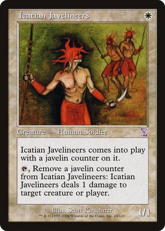
Could anybody tell me why exactly Wizards decided to use the most awful artwork from those available for the timeshifted reprint?!
No offense against the artist, but i just don't like that one for having this strange black shadow and that apogryphal background.
There were three artworks for this card in total: This one from Scott Kirschner, a satisfactory one from Melissa Benson (notice her typical monogram on the wall), and a really handsome one from Edward Beard, Jr.
That's my opinion, but i'm sure i'm not the only one thinking that way.
Laguz
★★★★☆ (4.9/5.0)(6 votes)
Excellent card in the early game as it kills the majority of one drops while keeping out of harm's way. Most importantly, it kills llanowar elves and birds of paradise.
Definitely a solid one drop that will surprise the heck out of you if you try it out.
holgir
★★★☆☆ (3.2/5.0)(3 votes)
I totally agree with your artwork ranking here Mode. And I chime in with Laguz about the goodness of this innocent looking card.
DoctorKenneth
★★★☆☆ (3.5/5.0)(5 votes)
I agree that this is the worst art of the three by far, Mode, but I'd swap your placement of the other two. Handsome? That man doesn't have muscles, he has grapefruits under his forearms and flesh-coloured plate mail. He's vaguely herculean and dashing, I'll admit, but that gives him no excuse to have t-rex arms and a box for a head.
Oddly enough, despite the pluralization, this is the only art with multiple creatures in it, as much as they are, in fact, what happens when a Planeswalker attempts to summon beings from Graffiti Kingdom.
Though at least Phil Foglio didn't go anywhere near this. That we can all agree on, I'm sure.
h00d1um
★★★★☆ (4.5/5.0)(6 votes)
i totally disagree with all of you. this version of the card is far superior to the others in many ways. Balance, texture, composition, colour and tone are all design elements present within the Scott Kirschner. its a much more interesting piece than the other 2 versions.
the minimalistic art style that Magic had in the earlier sets is missing from the newer cards. they made the correct decision chosing this version over the others.
HairlessThoctar
★★★★☆ (4.0/5.0)(3 votes)
Props for using the best art. Though I am a fan of the rewards card: http://sales.starcitygames.com/cardscans/MAGPRM/promoicatianjavelineers.jpg
I'm a sucker for this card. Even if he's not very good compared to his red brethren, direct damage outside of red on a one drop of all things is amazing.
A3Kitsune
★★☆☆☆ (2.0/5.0)(1 vote)
The Melissa Benson artwork is the best of the three, the Edward Beard, Jr one is good, Phil Foglio is a great artist who would produce very good or great art if he did a version of this card, and this version is not only the worst of the three, it does not even fit the Icatians. It looks like some red tribefolk. Could it originaly have been for a card that got canceled?
FragNutMK1
★★★☆☆ (3.5/5.0)(2 votes)
Having a more abstract feeling to the artwork was nice, it let you use your imagination instead of having the obvious "Vampire-on-a-stick" feel to it.
Mode, actually I like that art better than the others because it fits in the mood of Fallen Empires. Remember Fallen Empires is all about the fall of once mighty societies. So this kind of shadowy art fits in the mood. Of course, question of taste.
feeble2002
☆☆☆☆☆ (0.0/5.0)
One of the best white 1 drop creatures. The utility is great. Even had 4 copies in a vintage tournament deck (U/W fish) that won 1st place. Solid tournament card. 5/5
kiseki
★★★★★ (5.0/5.0)(3 votes)
Solid one-drop, as has been said. Also, there is something very special about using a contagion clasp to buff your fallen empires cards.
I remember my dad used to always go to the kitchen and get a toothpick for his counter.
Good times.
Winterhawk200
☆☆☆☆☆ (0.0/5.0)
opponent casts ball lightning, cute. tap one damage to it.
blurrymadness
☆☆☆☆☆ (0.0/5.0)
A good 1-drop soldier and human. Not a bad way to kill off small creatures while your Swords (or other kill spells) take out the big things.
Aquillion
☆☆☆☆☆ (0.0/5.0)
I think they went with this art mostly because it's distinct -- for the better or worse, Magic doesn't do cards with this style of art anymore, and they wanted to evoke the game's past.
Comments (19)
No offense against the artist, but i just don't like that one for having this strange black shadow and that apogryphal background.
There were three artworks for this card in total:
This one from Scott Kirschner, a satisfactory one from Melissa Benson (notice her typical monogram on the wall), and a really handsome one from Edward Beard, Jr.
That's my opinion, but i'm sure i'm not the only one thinking that way.
Definitely a solid one drop that will surprise the heck out of you if you try it out.
Oddly enough, despite the pluralization, this is the only art with multiple creatures in it, as much as they are, in fact, what happens when a Planeswalker attempts to summon beings from Graffiti Kingdom.
Though at least Phil Foglio didn't go anywhere near this. That we can all agree on, I'm sure.
the minimalistic art style that Magic had in the earlier sets is missing from the newer cards. they made the correct decision chosing this version over the others.
Though I am a fan of the rewards card: http://sales.starcitygames.com/cardscans/MAGPRM/promoicatianjavelineers.jpg
I'm a sucker for this card.
Even if he's not very good compared to his red brethren, direct damage outside of red on a one drop of all things is amazing.
Good times.