I hope there comes a time when Wizards realize that CG does not look better than hand-drawn stuff.
DarthParallax
★★★★☆ (4.1/5.0)(5 votes)
TomTomat: it is not as clear-cut as that. Look at Goblin Recruiter's original art. Frankly, it is way too crude and sucks for something that's that awesome.
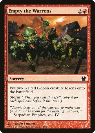
Now, I will agree that I am Usually partial, lovingly, under-doggedly, to hand-drawn over digital. But I prefer this art over it's original. It feels like there's more Goblins here than there are in the Time Spiral one, and it turns out that Storm Cards have better justice done in their art when the art assumes you have a high storm count.
But I DO appreciate that the old art style is very cool and beautiful. The thing is, it's nearly dead. And with the Modern Frame, they're almost never -actually- going to look like they used to. I think, though, that they are trying to look a little bit more realistic. I don't mean 'SO-CGI-it-looks-like-World-of-Warcraft"....no, I think they're Attempting to move their Art Style more towards looking like it's coming out of high-quality Graphic Novels...a 'tad' hyper-real, but in a way where it's a little more normal for your imagination to 'go with it'.
I have to be honest, some of the Izzet art was strange this year. Being Izzet, they PULLED OFF looking a bit like World of Warcraft...and actually, hand-painted was what looked wrong for them. Blast of Genius. Or that promo of Render Silent. WAY too much Yellow.
Magic Art Style is difficult to get right- because each theme and subtheme and setting kind of wants a whole different style.
That's why I'm Glad they use tons of different artists instead of just one, and that's also why and how we get so much differences in arts- the art is almost never going to really feel consistent with itself for long.
But...IDKN, what they're doing seems to work more often than it doesn't.
Totema
★★★★★ (5.0/5.0)(6 votes)
I like this art more because it feels more dynamic, which works for the general feeling of goblin cards. The other art was like, "Pose as a team, because shit just got real!" Goblins don't pose, they rush over you while wielding pointy objects.
SyntheticDreamer
★★★★★ (5.0/5.0)(3 votes)
New art is awesome. It actually looks like the warrens are emptying, as opposed to the old one with a bunch of goblins just standing there.
Comments (4)
Now, I will agree that I am Usually partial, lovingly, under-doggedly, to hand-drawn over digital. But I prefer this art over it's original. It feels like there's more Goblins here than there are in the Time Spiral one, and it turns out that Storm Cards have better justice done in their art when the art assumes you have a high storm count.
But I DO appreciate that the old art style is very cool and beautiful. The thing is, it's nearly dead. And with the Modern Frame, they're almost never -actually- going to look like they used to. I think, though, that they are trying to look a little bit more realistic. I don't mean 'SO-CGI-it-looks-like-World-of-Warcraft"....no, I think they're Attempting to move their Art Style more towards looking like it's coming out of high-quality Graphic Novels...a 'tad' hyper-real, but in a way where it's a little more normal for your imagination to 'go with it'.
I have to be honest, some of the Izzet art was strange this year. Being Izzet, they PULLED OFF looking a bit like World of Warcraft...and actually, hand-painted was what looked wrong for them. Blast of Genius. Or that promo of Render Silent. WAY too much Yellow.
Magic Art Style is difficult to get right- because each theme and subtheme and setting kind of wants a whole different style.
That's why I'm Glad they use tons of different artists instead of just one, and that's also why and how we get so much differences in arts- the art is almost never going to really feel consistent with itself for long.
But...IDKN, what they're doing seems to work more often than it doesn't.