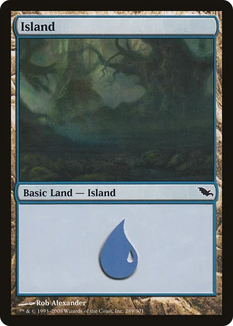
Looks a lot more like a Forest or a Swamp than a Island to me.
DellamorteDellamore0
☆☆☆☆☆ (0.5/5.0)(1 vote)
I hate this art with all the fiber of my being.
Feralsymphony
★★★★★ (5.0/5.0)(1 vote)
Am I the only one who likes this art?
Smauls
★★★★★ (5.0/5.0)(1 vote)
I've very picky about what lands I use in my decks. This island goes in any deck where I'm playing black. It doesnt quite fit in a u/w deck, or really, u/anything but black.
divine_exodus
☆☆☆☆☆ (0.0/5.0)
This art isn't that bad guys, I don't see where all the hate is coming from. It's not John Avon, all right, but still! It could be worse!
Mode
☆☆☆☆☆ (0.0/5.0)
I'm rating any basic land 5/5 even if the art sucks :P Feels wrong to rate basic lands by art and other cards by use. At least it'd be inconsistent rating. (I'm for example also rating all printings of one card equally and none better because of different design or artwork.)
Although i admit the art suggests it also looks a bit like a swamp or like a forest (and therefore could be used as art for a UBG land), i really like the art. And guys, it's from Shadowmoor after all. All lands from that expansion look somewhat dark.
Henrietta
★★★★★ (5.0/5.0)(1 vote)
It's not really inconsistent to rate basic lands by art because they're completely different from normal cards. Basic lands go in practically every deck, with very few exceptions, they're a fundamental part of the game unlike any one particular card, and they have over 150 different arts for them.
y_3
★★★★★ (5.0/5.0)(1 vote)
I don't think it fits the card at all, but I like the art.
magicpablo666
☆☆☆☆☆ (0.5/5.0)(1 vote)
I'm fine with the art, it's the ability that gets me. A land that taps for blue mana? Ha. About as usful as Scorching Spear.
KokoshoForPresident
☆☆☆☆☆ (0.0/5.0)
I like this art! Black is one of blue's ally colors. It is rightfully dark looking.
Sago
☆☆☆☆☆ (0.0/5.0)
Looks too much like a swamp. I know shadowmoor is supposed to be all dark and stuff, but this doesn't look like an island at all.
Lifegainwithbite
☆☆☆☆☆ (0.0/5.0)
@magicpablo666: We get it. You don't like blue. Stop searching for islands just to complain about blue.
Comments (13)
Feels wrong to rate basic lands by art and other cards by use. At least it'd be inconsistent rating.
(I'm for example also rating all printings of one card equally and none better because of different design or artwork.)
Although i admit the art suggests it also looks a bit like a swamp or like a forest (and therefore could be used as art for a UBG land), i really like the art.
And guys, it's from Shadowmoor after all. All lands from that expansion look somewhat dark.